Barmenia: enhancing a brand
A new identity: easy and personable
Barmenia is one of the largest independent insurance groups in Germany. In the insurance market, which is characterized by standardization, cost pressure, comparison sites and consolidation, Barmenia has decided to continue to focus on people, and thus, on individual sales. Barmenia has neither budget nor cost advantages over the large corporations, but its proximity to customers clearly distinguishes it via personal advice and support. From person to person: only companies that place their customers at the center of their business activities can be successful in the long term. However, insurances are usually perceived as complicated. We wanted to change that, too. Especially in the digital world, a user-friendly experience is a real success factor. We made both of these factors the core of our idea.
A unique positioning and a memorable claim
We have turned simplicity and humanity into our emotional added values – for customers, employees, sales, and direct business. All of this is precisely reflected in the claim “Barmenia: easy and personable” (Barmenia. Einfach. Menschlich.)
The performance promise: #HappyToHelp (#MachenWirGern)
How people think and act at Barmenia corresponds to a particular attitude. We wanted to make this attitude even more tangible. Whether it’s an offer, claims settlement or simply helping the insured, everything falls under the motto #HappyToHelp. This applies just as much to dealing with customers as it does to dealing with colleagues. This creates identity for Barmenia as an employer too.
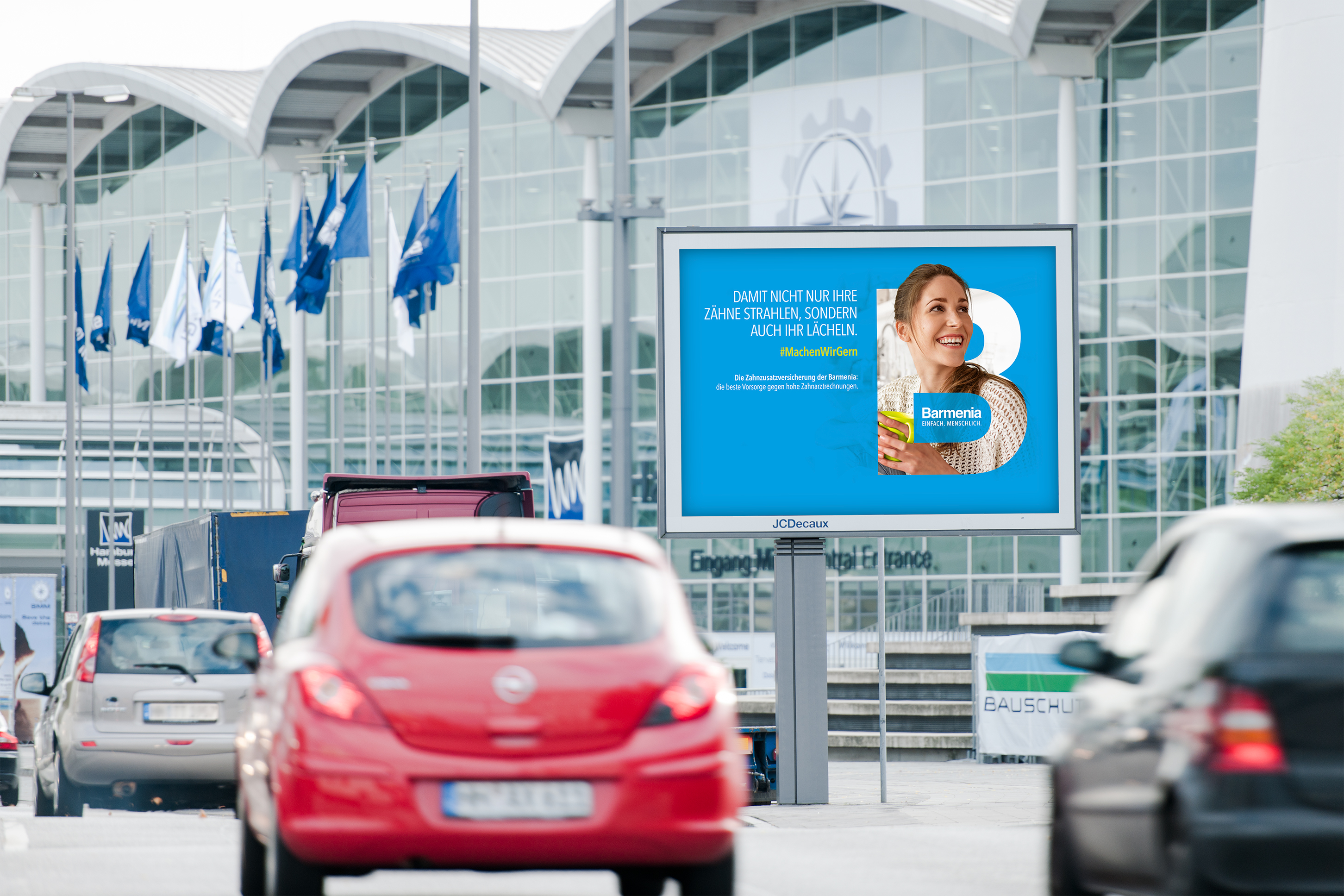
A look that makes Barmenia visible
Attention is a scarce resource. This made it all the more important for us to create a striking visual that makes Barmenia recognizable at first glance. The color cyan was already present in the brand. We made it – as well as the letter “B” – the central element, protecting customers and employees in a wide variety of life situations.
Mobile first
In terms of design, only things that also function digitally can survive nowadays. Comparison sites give providers little space – usually only enough for the logo. Other digital advertising spaces can often only be customized to a limited extent. That’s why we have made the “hallmark” of the letter B into a logo, giving the Barmenia lettering more personality.
Brand work: far beyond communication
Barmenia wants to live the principles of simplicity and humanity. That’s why a change process was set up with TRACK, wherein employees can examine processes and products and design them with people in focus. It is becoming increasingly important for brands to practice what they preach.